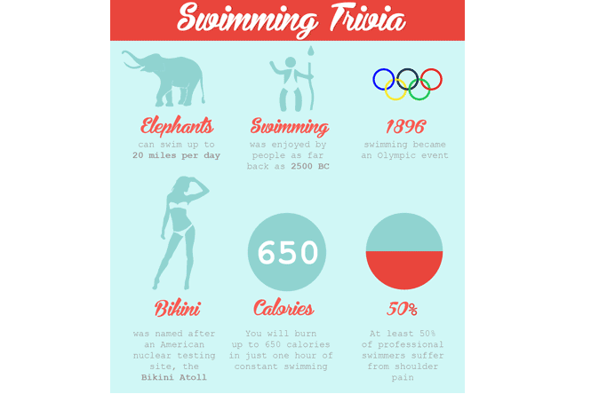
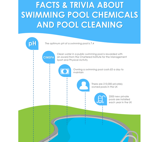
Infographics are everywhere online and in the news. They convey news, information, statistics, facts, figures and trivia. They are used as a marketing tool, as a way to quickly educate large numbers of people and to present a single point of reference on any given subject.
What is an Infographic?
An infographic is a representation of data as a visual graphic. Infographics are often used when there is a large amount of data to present and it needs to be conveyed clearly and for it to be easy to understand.
They are used to take information to a very wide audience and the key aspect is that they simplify the required message.
The internet revolution of the last decade or so has seen a huge spread of their use throughout the media, as software development has made the creation of them accessible to all designers to be able to incorporate them into television news items, music videos and websites. They are now a very popular tool for conveying statistical data, survey results, details of a new product or to promote a specific brand. They are even used as a recruiting tool to show a visual representation of the candidate specification and the responsibilities of the vacancy.
Every day, more and more information is fed to the world through the internet. It’s now become very difficult to take in all the data which is presented and there can be instances where important information is missed or dismissed due to lack of time to sit and really focus. Infographics fill that void so we can now receive and process the message and quickly move on with our next task.
Why have they become popular?
Infographics have become popular because they are a good way to communicate a large amount of information in an easy to understand way. Our lives are filled with news and facts we need to take in and remember every day through either work, our social lives or the constant stream of images and text online and so more complicated data needs to be conveyed in a way that it can be seen as a single snapshot , digested and stored in the brain.
Using the term infographics as part of a search engine request has risen over 800% over the last couple of years. With phones, tablets and computers being checked more and more on a daily basis for news and for shorter amounts of time, there is the need to grab the attention of the user to give them the information they are looking for.
Infographics are also very easy to share. Large amounts of statistical data are not easy to send to others due to sheer bulk, but social media sites are full of infographics which are then shared by thousands – and sometimes millions – of people at the press of a button. This means that the information spreads around the world and can be accessed quickly by huge numbers of people and in turn raises the profile of the brand or website and becomes a talking point of bloggers.
What is the benefit of an Infographic?
The main benefit of an infographic is the fact that a message can be conveyed in seconds. The brain is very adept at taking in visual imagery and remembers it much more easily than blocks of written text; 90% of everything we remember is through visual representation. Infographics can deliver complex information in an easily understood format, they communicate quickly in our fast-moving society, they help to reinforce a brand due to the viral nature of their style of presentation, they give the opportunity for a much further reach and can be used as a sales technique when talking to prospective clients.
An infographic is also an important tool in raising traffic to a website. With the rise in search engine enquiries seeking information to be displayed as an infographic, those who utilise them within their websites have seen a growth in traffic to those specific pages and in turn to their site generally.
What makes a good Infographic
An infographic is not just about pictures and words. It should be designed so it is not open to interpretation – it has a universal message to all who see it. A good infographic is created from excellent data which has been well researched and is organised and structured, combined with a visual style that acts as a cognitive tool. The first thing an infographic designer should think about is what the person viewing and reading the information is going to take from it and what will they then do with the data they now have knowledge of. Function should always be seen as more important than aesthetics and the finished piece should have taken a concept, presented the data, told a story and be presented through a design that is relevant and has impact. Keeping an infographic timely is also important if the aim is to create a buzz surrounding a new product or service being offered. You will want global bloggers such as Huffington Post or Mashable to pick up on your infographic and use it alongside current trending topics or indeed create a talking point of its own.
How to create an Infographic
The first step to creating an infographic is to choose your subject. Don’t think just about your specific business, look at all the topics which surround it but still have a close connection to your company or website. As an example, if you own an online art shop, don’t create an infographic called ‘Different kinds of pens I sell’, create one which is of universal appeal such as ‘Facts about famous artists of the last 500 years’ or ‘Different styles of painting and drawing’. It’s then all about finding out the information to include – be prepared to dig deep into your own knowledge and experience and to then look for unusual information which will really make your infographic stand out amongst other ones on a similar subject. When you create an infographic, you are looking to provide as much value as possible in a single snapshot.
The design of an infographic needs to be both creative and logical. Try dividing it into a number of categories such as statistical or trivia based data and you can then determine the size of infographic you will be designing as well as the basic layout.
It’s important to use relevant colours, shapes and icons; for the art shop owner, images of paint brushes, scissors and a palette could all be incorporated. You could place a percentage statistic in each hole of the palette perhaps or put the text of each trivia fact into a different paintbrush handle.
It’s important to know when to stop as too much information can make the message very complex to comprehend. Infographics are about making something much simpler to understand and not to complicate the subject any further.
It’s important that those who see your infographic know the source. Always include a logo and a domain name. Not only does it raise your profile, it means you can claim ownership of your work.
If you know you want to use this method of communication but aren’t sure about your own design skills, you can talk to designers who can take your ideas and either create your image with your own information or can also research and gather the facts and figures for you.
How to monitor infographic effectiveness
There are a number of tools which can be used to monitor the effectiveness of your infographic and to track its spread. Your Google Webmaster Tools account gives you an analysis of your traffic and will show the rise in visits to your site through someone clicking on your image. There are also a number of software programmes available to be able to measure your social media presence or to manage your marketing campaigns.
Every day, we are all fed huge amounts of information. The days of news being a day old through the print presses or on television three times a day on just a couple of channels are gone. We are surrounded by a constant stream of data and statistics which we are all told we need to know. We find ourselves spending less time reading the news but on a greater number of occasions. We need to know the facts – and quickly. Infographics are the way our brain can process everything with a much higher likelihood of retaining what we need to know. Whilst their history can be traced back for many years, their application is more relevant and prevalent now than it has ever been and with there being no sign of the flow of information slowing down, the age of the infographic is certainly part of our daily life in the 21stcentury.
Author: Julian Saunders is the founder of High Impact.
You can find on him on Google + here.


